Make my background image responsive
Blogger's got a nice selection of backgrounds to choose from when you're customizing your template. Recently, they made some changes to make them responsive.
If you don't know what I mean by responsive, try reducing the size of your browser window, and you'll see the background of this blog re-requested as a smaller version of the background image).
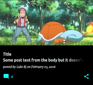
This actually has a massive impact on bandwidth for your readers. Take, for example, the background of this blog:

If you don't know what I mean by responsive, try reducing the size of your browser window, and you'll see the background of this blog re-requested as a smaller version of the background image).
This actually has a massive impact on bandwidth for your readers. Take, for example, the background of this blog:
- Full size (370KB)
- 1600 wide (319KB) - 13% smaller
- 1200 wide (236KB) - 36% smaller
- 800 wide (186KB) - 50% smaller
- 640 wide (139KB) - 62% smaller
- 480 wide (65KB) - 82% smaller!
For anyone who has forked (customized) their template, though, the change may not been applied. If you've customized your template, using 'Edit HTML' on the template tab, but are still using the Blogger backgrounds, you should also add the following HTML gadget to your template.
The gadget contains the following custom markup.
The gadget contains the following custom markup.
<b:includable id='main'>
  <b:if cond='data:skin.vars.body_background.image'>
    <b:include name='responsiveImageStyle'
               cond='not data:view.isPreview'
               data='{
                       image: data:skin.vars.body_background.image,
                       selector: "body"
                     }' />
  </b:if>
</b:includable>
Note that the selector can be adapted to suit the way that your template's skin defines the background (e.g. in this template, the selector is ".bg_photo" instead.)
Happy templating!

how did you enter share icon to the right of the post? thank you
ReplyDelete