Get nicer thumbnails for my Post snippets
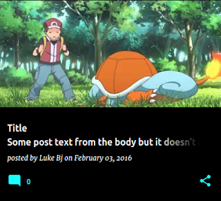
I recently received some feedback that my thumbnails are a bit nicer than the standard thumbnails offered by Blogger. This is because I use a custom snippet in my Blog widget, to produce bigger thumbnails, using the new resizeImage operator.
Note: This post leverages the techniques described in the article about Responsive images for Google photos.
Note: This post leverages the techniques described in the article about Responsive images for Google photos.
A note:
The resizing behaviour provided on Blogger requires that the image is hosted on a Google platform to work - provided that you add your images by uploading them in the editor, this technique should work.
Creating a responsive, resized Thumbnail
The resize operator takes 3 parameters - the URL of the image, the width to resize it to, and an optional ratio for a cropped version of the image.
In my Blog widget, I've customized the HTML so that on feed views (homepage, search, etc), I display post snippets instead of the full post. As a part of these snippets, I do a square-cropped responsive image. sourceSet is the srcset counterpart of the function for resizing an image.
<img expr:src=’resizeImage(data:post.firstImageUrl, 300)’ />In my Blog widget, I've customized the HTML so that on feed views (homepage, search, etc), I display post snippets instead of the full post. As a part of these snippets, I do a square-cropped responsive image. sourceSet is the srcset counterpart of the function for resizing an image.
<img expr:src='data:post.firstImageUrl'
     expr:srcset='sourceSet(data:post.firstImageUrl, [32, 64, 128], "1:1")'
     sizes='(max-width: 800px) 12vw, 128px' />
If you're not sure what's going on here, the breakdown by attribute is:
- src: The image source fallback, for browsers with no responsive support. The first image in the post.
- srcset: A set of (Image URL, Width) pairs, that tells the browser which URL to pick when the image is a given size.
- sizes: A hint for the browser what sizes the image will be displayed at. My thumbnail's CSS is 12% of the viewport width for small screens, and 128x128 on larger screens.
Applying it to your Blog
- Head to www.blogger.com
- (Select your blog)
- Hit 'Template'
- Hit 'Edit HTML'
- Hit 'Jump to Widget', select 'Blog1'
- Find the b:includable with the id 'post'
Once in that includable, you'll need to add a branch for whether it's a feed page or an item page.
<b:if cond='data:blog.pageType not in {"static_page","item"}'>
  <!-- Responsive image, and snippet -->
<b:else />
  <!-- The stuff that's already there. -->
</b:if>
Happy thumbnailing!


Comments
Post a Comment